Krakakoa Chocolate
Scope
Brand Identity
Packaging Design
Brand Guideline
About The Project
-
Indonesia is one of the world's major cacao-producing countries, yet much of its cacao has historically been exported as a commodity rather than experienced as a distinctive product with its own story.
Krakakoa set out to change that.
Working directly with Indonesian cacao farmers, Krakakoa produces chocolate that celebrates the character of Indonesian cacao while creating greater value for the people who grow it.
JED Creative was brought in to develop the brand identity and packaging system, helping turn this mission into a distinctive consumer brand.
-
The challenge was to communicate two sides of Krakakoa at the same time.
On one side is the agricultural reality of cacao—farmers, plantations, soil, climate and cultivation.
On the other is the refined experience of premium chocolate.
The brand needed to connect these worlds without becoming either overly commercial or overly artisanal.
Our approach was to make the origin of the cacao central to the brand experience.
-
The name Krakakoa references the Indonesian archipelago while creating a distinctive, contemporary brand name that could travel internationally.
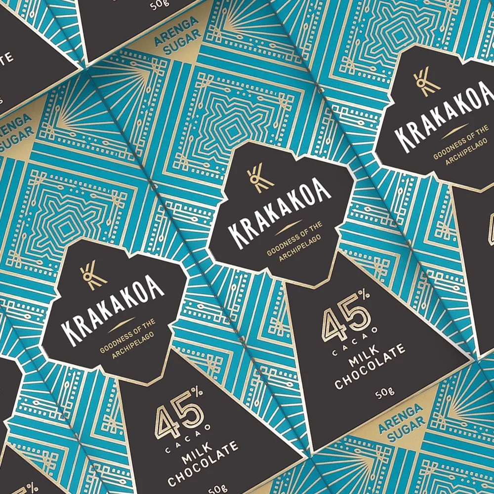
The identity and packaging build on this sense of place, using bold typography, expressive colour and graphic elements inspired by the natural and cultural character of Indonesia.
Rather than relying on generic luxury cues commonly found in premium chocolate, the system gives Krakakoa a personality that feels confidently Indonesian and contemporary.
-
One of the most important roles of the packaging was to communicate where the chocolate comes from.
Different cacao origins and flavour profiles become part of the visual system, allowing consumers to understand that Indonesian cacao is not one uniform ingredient—it has its own regional character and diversity.
The packaging therefore becomes more than a wrapper.
-
Krakakoa's business model is built around creating more value within the cacao supply chain.
By working closely with farmers and producing chocolate closer to its source, the brand connects agricultural production with the finished consumer experience.
Our role was to translate that model into a brand people could understand and desire.
The design needed to make the product feel premium enough to compete in the international chocolate market while remaining connected to its Indonesian origins.
-
The identity was designed to extend across a growing range of chocolate products and formats.
Packaging architecture creates a clear relationship between the master brand, cacao origin, flavour and product type, allowing the range to expand while remaining recognisably Krakakoa.
The system also gives each product enough individuality to create discovery and collectability on the shelf.
-
Krakakoa demonstrates how design can help shift perception—from commodity to craft, from ingredient to experience, and from local producer to global-facing brand.
By making origin, craftsmanship and people central to the brand, Krakakoa presents Indonesian cacao not simply as a raw material, but as something worth discovering, appreciating and celebrating.
From the people who grow it
to the people who love it.