Catto
Scope
Naming
Brand Identity
Brand Guideline
Packaging Design
About The Project
-
Today, pets are no longer simply pets. They are companions, family members and an important part of everyday life.
Catto was created around this changing relationship, a premium cat food brand focused on natural ingredients, quality nutrition and the belief that our pets deserve the very best.
JED Creative was brought in to develop the brand from the ground up, from naming and identity to packaging and brand guidelines.
-
The pet food category is often dominated by functional claims, clinical language and highly illustrative packaging.
Catto needed to feel different.
The opportunity was to create a brand that could communicate quality and nutrition without losing the joy of having a cat.
We positioned Catto as a brand that sits between premium nutrition and the emotional relationship people have with their pets.
-
The name Catto was created to be simple, memorable and playful.
It sounds unmistakably feline while giving the brand a distinctive personality that could extend beyond a single product.
From the beginning, the ambition was to make Catto feel less like a conventional pet food manufacturer and more like a contemporary consumer brand.
-
The visual identity takes inspiration from two of the most recognisable characteristics of a cat: its pointed ears and expressive tail.
These cues were translated into the Catto logotype and graphic language, creating an identity that feels playful without becoming childish.
The result is a visual system with enough personality to connect emotionally with cat owners, while maintaining the premium character of the product.
-
For premium pet food, trust begins with what goes into the bowl.
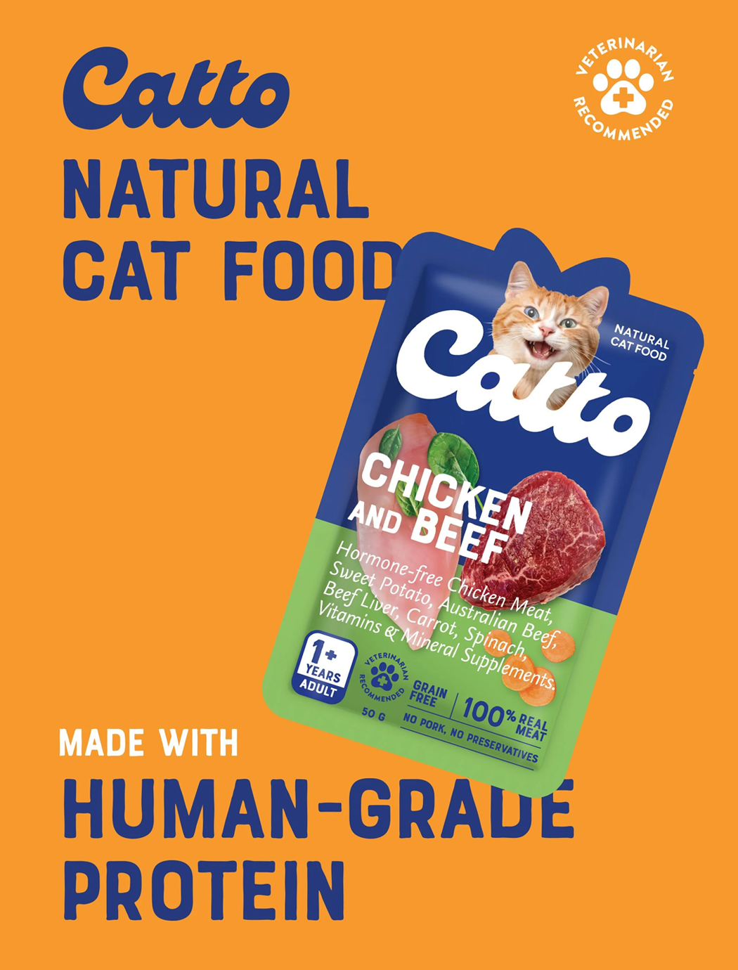
We therefore made the ingredients an important part of the packaging hierarchy.
Natural ingredients, protein and nutritional benefits are clearly communicated on pack, helping consumers quickly understand what they are giving their pets.
Photography and colour are used to make each variety distinctive, while a consistent architecture allows the growing product range to remain recognisable as one family.
-
As Catto expanded across different formulas, flavours, life stages and treats, the packaging needed to work as a coherent system.
JED developed a flexible packaging architecture that allows individual products to stand out while maintaining a strong relationship with the master brand.
From dry food to wet food and Creamies treats, the system creates consistency across the shelf without making every product look the same
-
Ultimately, Catto isn't only designed for cats.
It is designed for the people who care for them.
By combining nutritional credibility with warmth, personality and a sense of joy, Catto turns everyday pet care into something more considered and more personal.
Because when they're family, they deserve more than ordinary.