Edo
Scope
Brand Identity Design
Packaging Design System
Brand Guidelines
Edo is a house brand from Sukanda Djaya, offering a wide range of frozen bakery products including buns, pancakes, puff pastry, pizza bases and steamed pastries.
With a growing portfolio and multiple packaging formats, the brand had begun to develop inconsistently across its product range. The challenge was to create a stronger and more cohesive identity without losing the familiarity that consumers had already built with Edo.
JED Creative refined the existing Edo logotype and developed a new visual system designed to work across the brand’s diverse range of products.
Rather than creating a completely new identity, we focused on evolution and consistency, strengthening the existing brand equity while establishing clearer rules for typography, colour, imagery and product hierarchy.
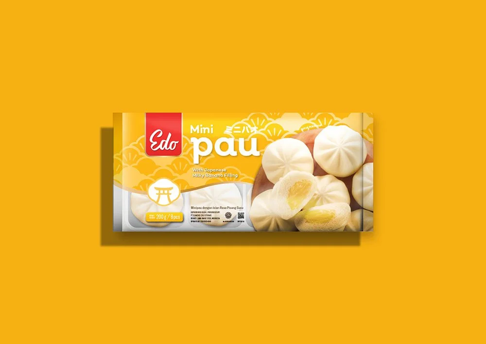
The packaging system was designed to make the range easier to navigate, giving each product its own character while maintaining a recognizable Edo family across the shelf.
The new system also provides a flexible foundation for future products, allowing Edo to expand its portfolio without compromising brand consistency.
The result is a more contemporary and cohesive Edo—a familiar brand with a clearer identity and a system built to grow.