Kamandalu Resorts & Spa
Scope
Brand Identity
Naming
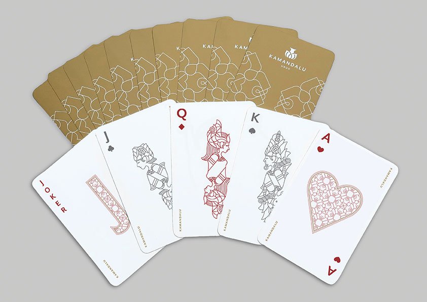
Collaterals Design
Signage Design
Brand Guideline
Art Direction
Website Design
Kamandalu Ubud is a luxury resort set within the landscape and rice terraces of Ubud, Bali. Established in 1992, the resort is built around the idea of a traditional Balinese village, creating a place where guests can step away from the pace of everyday life.
When JED Creative was invited to rebrand Kamandalu, the challenge was not simply to create a new logo. The resort had an established history and a strong sense of place, but its identity needed to evolve to reflect a more contemporary luxury experience.
The name Kamandalu provided the starting point. Derived from Sanskrit, a kamandalu is a vessel used to hold holy water. The idea of a vessel containing something precious became the conceptual foundation for the new identity.
We translated this meaning into a distinctive symbol inspired by the form of the kamandalu and its connection to water, purity and spiritual renewal. The symbol became the foundation of a broader visual language that could move naturally across the resort experience.
From guest collateral and signage to spa materials, stationery, website design and promotional communications, we created a flexible system that allowed every touchpoint to feel connected while retaining its own character.
Art direction played an important role in shifting the perception of the resort. Working with photographer Melanie Tanusetiawan and stylist Lianggono, we developed a lifestyle driven visual language that focused on the experience of being at Kamandalu, rather than simply documenting the property. The architecture was renovated by Hadiprana, providing a strong physical foundation for the renewed brand experience.
The result was more than a new identity. It was a repositioning of Kamandalu from an older, dated resort into a more distinctive and contemporary Ubud destination, one where Balinese culture, nature, hospitality and luxury come together as a complete experience.