Le Nord
Scope
Naming
Brand Identity
Packaging Design
Brand Guideline
Men’s personal care has become more sophisticated, but many brands still rely on familiar codes of masculinity, dark colours, aggressive typography and overtly functional communication.
Le Nord was created in Vietnam as a men's personal care brand built around more natural ingredients and a more considered approach to everyday grooming. JED Creative developed the brand from naming through identity and packaging.
The name Le Nord, meaning The North, became the foundation for the brand. North represents direction, a fixed point that helps you know where you are going. This idea gave the brand a simple philosophy: stay focused, find your direction and move forward.
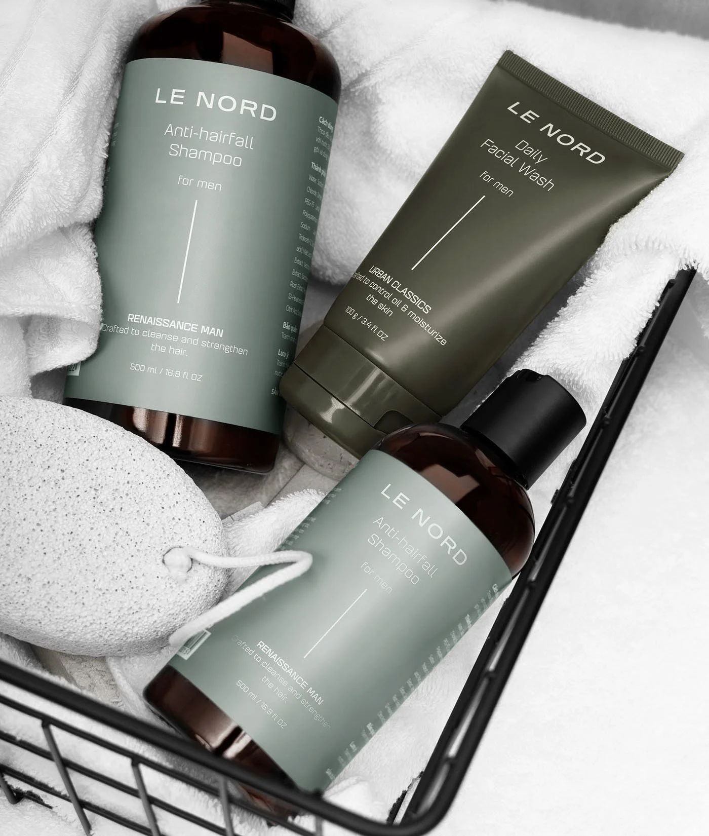
The vertical line in the identity reinforces this idea, creating a visual representation of direction and purpose. The resulting identity is clean, confident and understated, giving Le Nord a character that feels masculine without relying on conventional macho imagery.
The visual system was then extended across facial care, hair care and body care, creating a consistent product family while allowing each product to remain easy to identify.
Packaging uses a restrained combination of typography, colour and structured information to communicate the products clearly while creating a premium and contemporary presence.
The result is a men's personal care brand with a clear point of view, a distinctive identity and a visual system built to grow.
Photography by Lam Xuan Duy Van